
UX Designer · Healthcare SaaS · 2024
Project Goal
Signing up on a platform shouldn't be painful. This project is about challenging the status quo of prioritizing business needs over user goals — and finding better ways to balance both.

Takeaway
The Problem
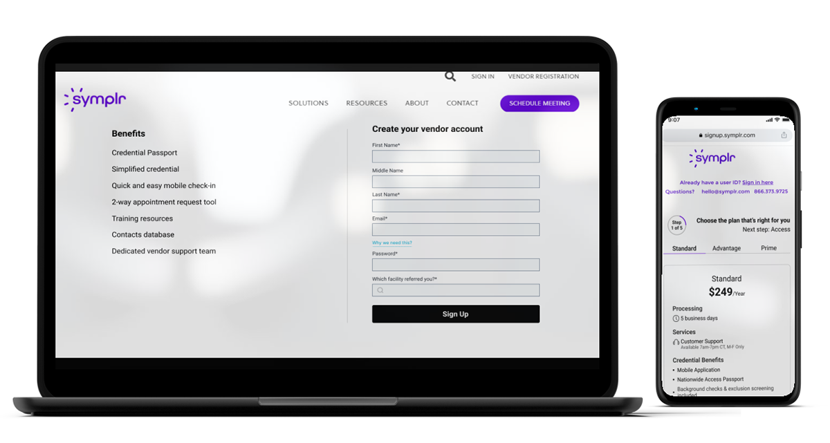
01 Non-visible benefits - symplr offers 3 subscription plans, but what benefits does the company provide? Why are they so hidden?
02 What does this number mean? - How many users sign up or how many users came to this page?
03 I Am signing up or logging in? - Don't use 'Sign in' and 'Sign up' together - not sure what's going on on this page; It isn't apparent.
Redesign Goals (Solution)
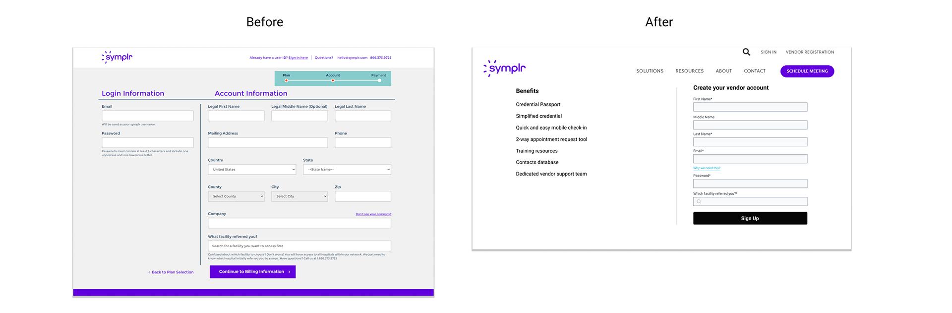
The sign-up experience is mainly similar to a desktop presentation; over half of the audience is mobile, so the omnichannel approach is essential to cleaning house and restructuring as a multi-device. The reduced footprint will allow the same small teams to make more effective changes across all devices from a single code base, and users will have a unified experience.
Key Refinement: Simplicity is the key
Simplify the experience to work consistently across all platforms without losing functionality in web & Mobile.
Key Refinement: Introducing Stepper
Respect the user's time by neatly organizing data in standard, familiar formats and introducing Stepper so that users will know how many steps to take until the sign-up process.
User Testing
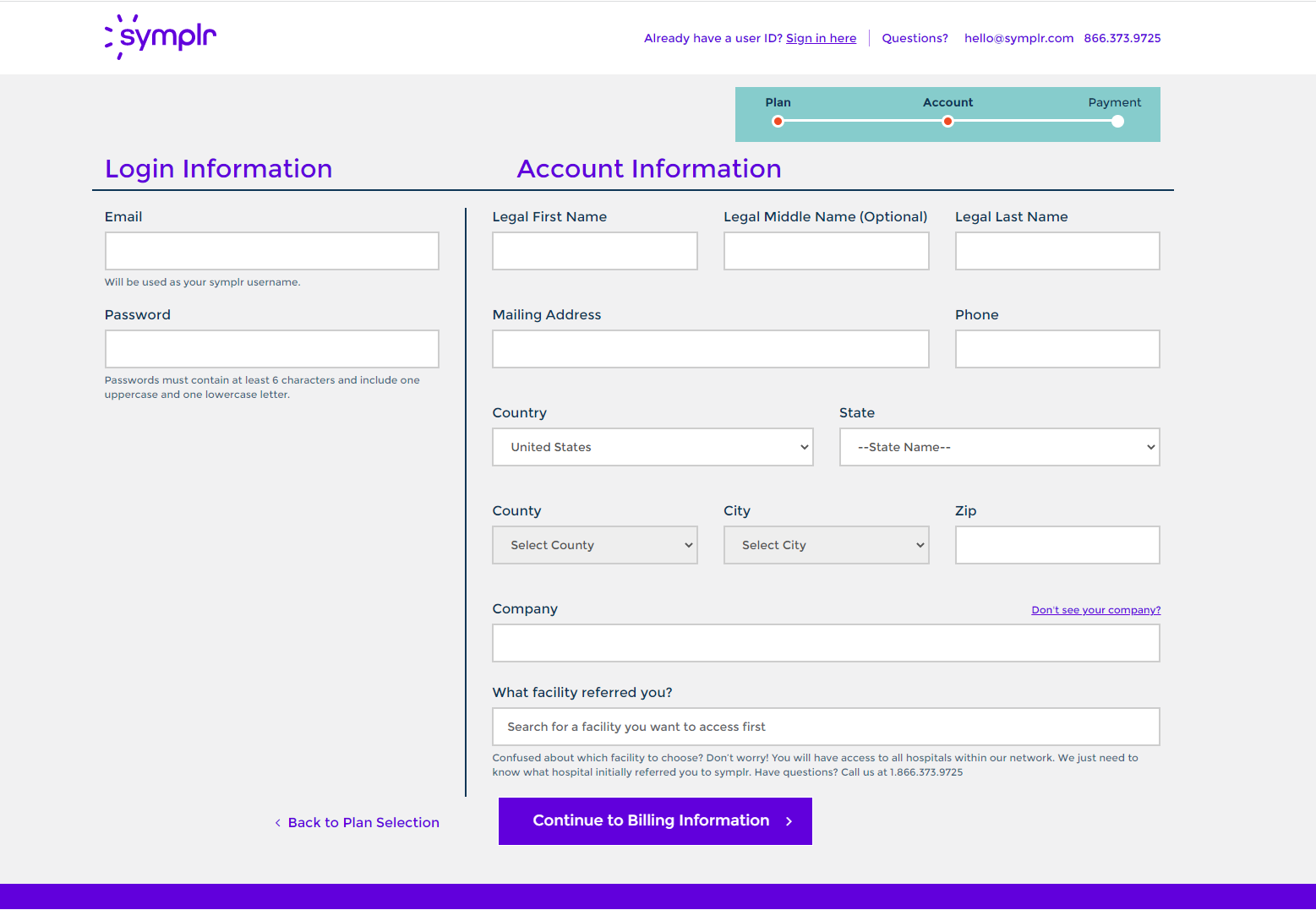
01 Account creation — structured, with field guidance.
Login and account information split into clear regions. Password requirements surfaced upfront. Address fields cascade — Country → State → County → City — to reduce invalid combinations.
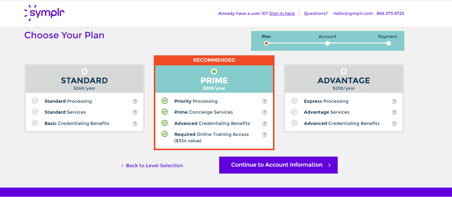
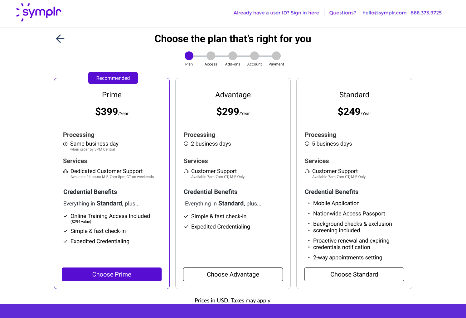
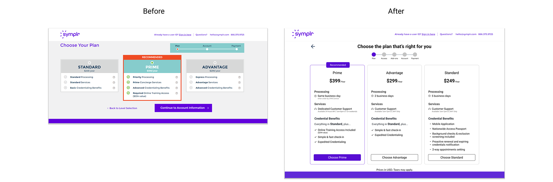
02 Plan selection — comparison, not paragraphs.
Each plan now reads in three lines. Benefits abstracted into named tiers so users compare across columns instead of reading paragraphs.
Each plan now reads in three lines. Benefits abstracted into named tiers so users compare across columns instead of reading paragraphs.
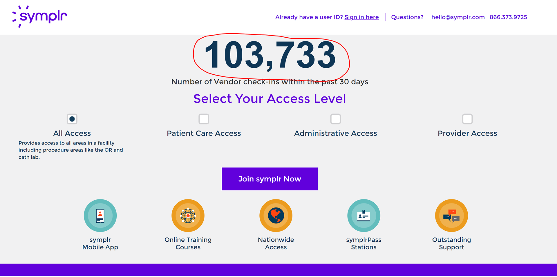
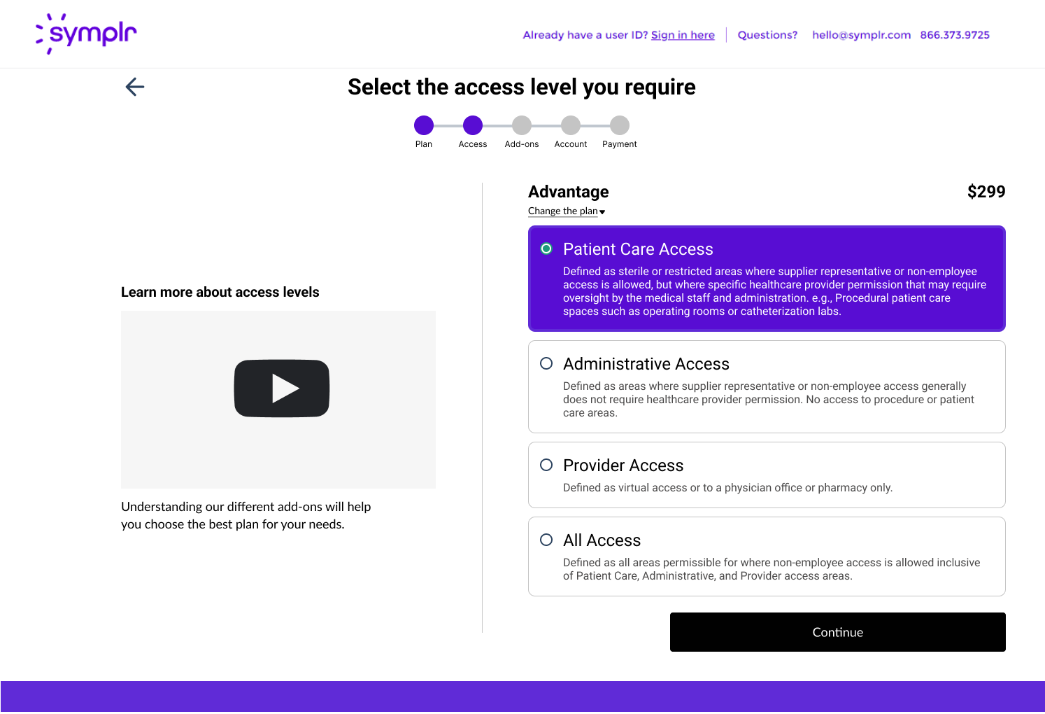
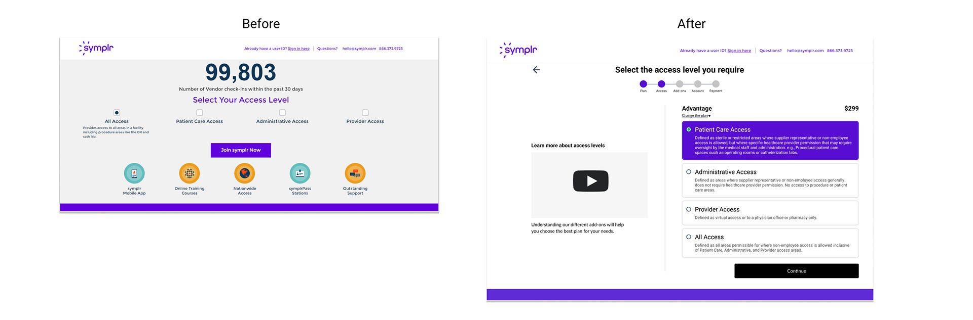
03 Access level — the highest-leverage step.
Access level determines which credentials a vendor must submit. Get it wrong, and onboarding is delayed by weeks. The original flow asked for it as a dropdown with no context.
Access level determines which credentials a vendor must submit. Get it wrong, and onboarding is delayed by weeks. The original flow asked for it as a dropdown with no context.
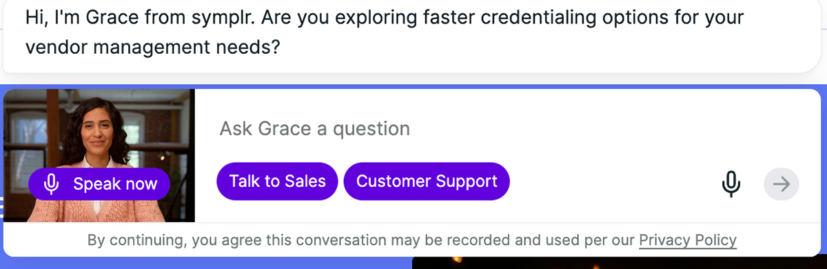
04 Meet Grace — a video chatbot for the decisions that need a second opinion.
Some vendors knew exactly what to pick. Others needed context — what does Express Processing actually mean? Which access level fits a cath-lab tech? Grace meets them with a real face, voice input, and a fast path to Sales or Support.
Some vendors knew exactly what to pick. Others needed context — what does Express Processing actually mean? Which access level fits a cath-lab tech? Grace meets them with a real face, voice input, and a fast path to Sales or Support.
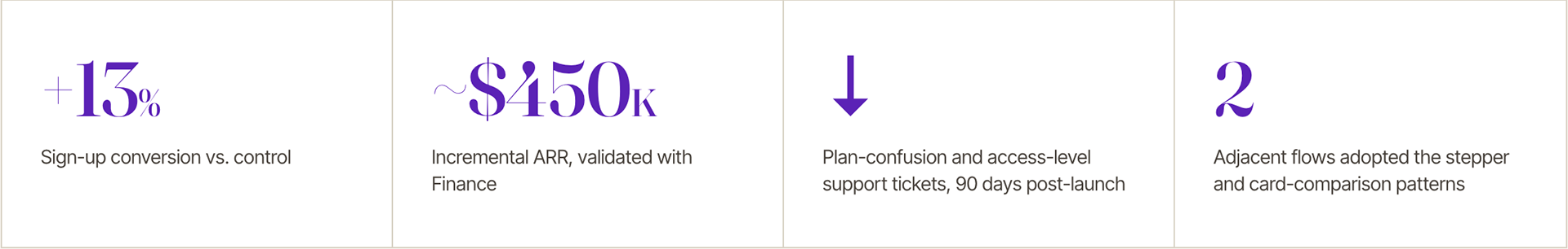
Validated against the metrics we agreed on upfront.
The success metrics from the alignment memo became the rollout gate. Every number below maps to a function that signed the memo
Reflection
The leverage isn't in the pixels.
The technical craft on this project was unremarkable — cards, a stepper, clearer hierarchy. None of that is hard.
The work that mattered was upstream: making a distributed problem legible to the people who could fund fixing it, getting four functions to agree on what "done" looked like before anyone opened Figma, and shipping the fix as a pattern so the gain wouldn't decay.
That's the shift I've been working on as I've grown into staff scope. The leverage isn't in the pixels. It's in defining the problem in a way that makes the right solution obvious to people who don't think about UX for a living — and then in shipping the work in a form that compounds.