
◆
images/p2-01-signup-final.png
Registration, as it ships — plans first
A long sign-up form asked for everything before it had earned anything. I put the choice first, cut the form to what an account actually needs — and shipped it.
The original sign-up treated account creation and account setup as the same task. Before a user had anything at all, one long form wanted organisation details, role information and profile fields — real effort spent before the product had given anything back.
That's an expensive first impression for a product people don't choose to use. Vendor reps arrive at registration because their job requires it, and every field between them and a working account is friction they didn't ask for.
Two questions drove the rebuild. What does a person need to decide before they commit? And what does the system actually need to create an account? The answer to the first came before the form; the answer to the second was far less than the form was asking.
Registration is a paid subscription, but the old flow asked people to fill in a form before showing them what they were buying. The choice that actually mattered — which tier, at what price — sat behind the effort rather than in front of it.
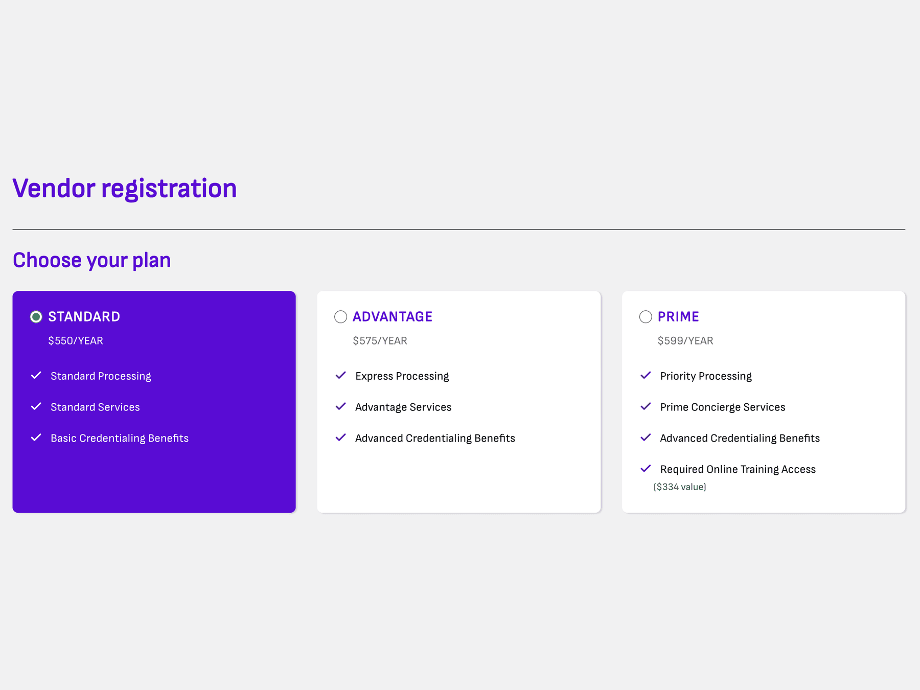
Plans now come first. All three tiers sit side by side, separated by the thing vendor reps care about most: how fast credentials get processed. Shared features repeat in every column rather than hiding in a footnote, so a column can be read on its own instead of by cross-referencing. Only after choosing does anyone meet a form.
I went through the form field by field and sorted every one into two piles: required to create the account, and required eventually. The second pile was much larger than the first.
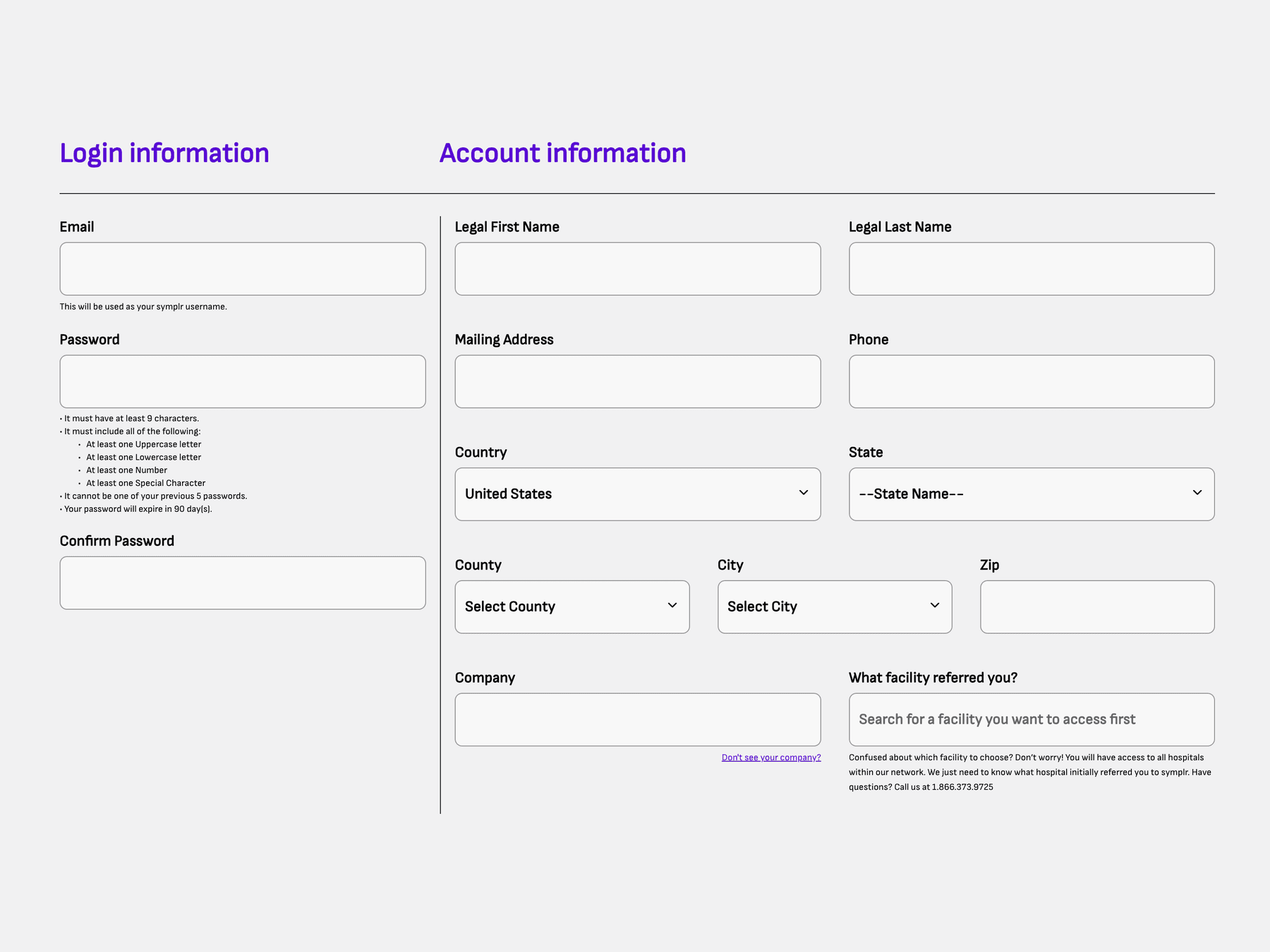
What stayed is split into two plain columns — Login information, the credentials you'll sign in with, and Account information, who you are and where you work. Password rules are stated up front rather than revealed by failing them, and the helper text under each field answers the question that field provokes instead of restating its label.
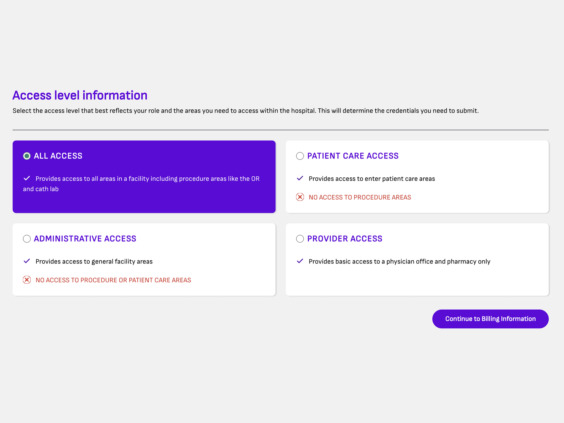
Access level decides which credentials a rep has to submit, so getting it wrong is expensive later. Buried among address fields, it was a dropdown people guessed at.
It became its own step, with each level as a card that states what it grants — and, in red, what it doesn't. Saying no explicitly is what makes the choice safe: a rep who needs the OR can see at a glance that Patient Care Access won't get them there. Only then does the flow continue to billing.
The rebuilt registration flow shipped and is what new symplr vendors meet today.
Plans are compared side by side before anyone fills in a field, and account creation now asks only for what an account requires.
Access level gets its own step, stating plainly what each level does and doesn't grant — so the choice that decides which credentials you owe isn't a guess.
If something in your product is costing people time every day, that's the one I want to hear about. Send me the flow and where users stall — I'll tell you what I'd look at first.